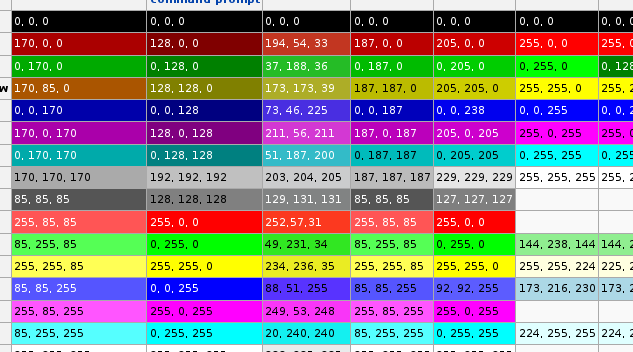
As a part of our work on ANSI escape code coloring, I looked in detail at default colors used in different command line terminals. It appears form the Wikipedia article that colors are set at their brightest level with minor variances across implementations:

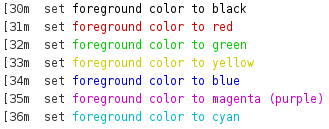
Adapting these color schemes gives the result as in the following picture:

If you try to read the text very quickly, you’ll find it not exactly easy on the eyes. Actually it may hurt a little bit if you do so for a while. Also, looking at the text from a distance – some text lines clearly stands out (magenta, cyan) while others are hardly visible (yellow).
Default terminal colors do not take into account human perception of color brightness – luminance. So I spend some time looking around for a solution. There are various formulas found for luminance calculation, among them these:
- 0.2126*R +0.7152*G +0.0722*B
- 0.299*R + 0.587*G + 0.114*B
- sqrt( 0.241*R^2 + 0.691*G^2 + 0.068*B^2)
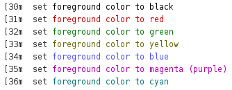
As it turned out, only the last one works reasonably well. Taking into account the luminance, we have the following adjusted colors:

At first sight there is no real difference to what we had above. But there is. Here are both palettes next to each other:

Yellow is readable (although subtle) green stands out, cyan is darker. Look at the picture from distance. You will see how more coherent the right side is.
We decided to use the adapted palette. Although the colors are not as vivid as they could be, the colors can still be distinguished but more importantly they are now a lot more readable.
